


Signet SKU Portal
Adding merchandise to Signet's inventory
Company
Signet Jewelers
Role
Product Designer
Timeline
Feb 2025 - May 2025
Team
Problem
92% of inventory requests included rejections because of legacy out of the box software.
Solution
0->1 new Signet SKU portal
Context
Adding new merchandise to Signet's inventory wasn't exactly straightforward.
External vendors used the Signet SKU Portal to submit new items, while the internal merchandising team used it to reviews those submissions.
Problem
Out of the box software
The old SKU Portal was 3rd party software that offered very little customizations. Vendors often didn’t submit completed product requests, which caused a lot of back and forth between vendor and merchandising team in order to finalize an approved product.
The old SKU Portal was visually outdated. Windows 2000 aesthetic had her moments, but she needed some TLC.
Solution
Don't burden the vendor and merchandising team
Make SKU Portal work for the users. Bring SKU Portal in-house so it can be customized to meet user and business expectations.
Design
A new, old visual language
I established the visual language by using Signet's AMOR design system. The goal was to simplify the UI for clear navigation and allow users to view as much information as they needed.
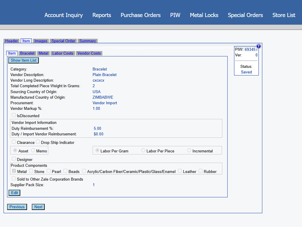
Autocomplete for ease
To encourage searching accuracy and product request completion, I pushed for predictive text and searchable dropdowns on the search page and form fields. This helped users narrow down from a long list of options and more quickly find options.
No endless scrolling
It was challenging trying to create space for lots of data. I affixed the actions and interact-able elements to the left so users can still identify and compare SKUs after horizontally scrolling. I designed a feature where users can adjust the table columns to give them data flexibility.

One source of truth
The old SKU Portal only tracked a product’s progress through its status. I added an info panel, activity log and chat feature to keep everything in one place, so anyone—like a vendor or merch team member—can easily understand what’s going on.

Tabs within tabs 🚫
The old SKU Portal used nested tabs, which made it hard to relate the info between tabs and their sub-tabs. It also created a hidden hierarchy that wasn’t always obvious to users.
I explored different ways to show the hierarchy, and using two sets of tabs made the most sense given the complex information architecture.


Final designs of key pages
Next Steps
Design QA
Check in regularly during dev syncs to answer any UX/UI questions
Review staging environment to make sure everything looks and works as intended
User Testing
Collaborate with UX researchers and PMs to validate the experience and gather feedback for future iterations